It's not easy surviving without an Iphone in a world where seemingly everyone these days is walking around with them. Everywhere you look you see the shiny metallic cases. A few feet above, sometimes right next to, aforementioned shiny cases you'll often see the inanely grinning, vaguely superior smug looking mug of the owner of the thing looking at you in a compassionate sort of way. The compassion, of course, is something that all owners of any Apple product must be familiar with - subconsciously or not. It's compassion felt for anyone not brandishing, wielding, or otherwise owning an Apple product. Surely there can be no substitute for the vaunted Iphone? Surely there can be no alternative for the app store, with it's 50 gazillion apps of many shapes and sizes?
Well. Maybe there is.
While my erstwhile companions were out of the country, I took it upon myself to sneak off and perform a tiny act of rebellion. I bought an HTC Hero, also known, I believe, as the Google G2. I'm sure Shizzle, the Captain and Nacho would not approve. I figured: If everyone has an Iphone, why not go against the grain just a tiny bit and see if something can even get close in functionality and style to it.
So how does it compare? Interested? Read on...
It was with great trepidation and mounting guilt that I left my interplanetary cave last Friday to go out and pick up an HTC Hero phone, color white. I'd arranged with a shop that it would be held for me and had been told to swing by on Friday in order to pick it up.
The trepidation was caused by my apprehension about whether the thing would be any good at all. I was paying for it out of my own pocket, after all, and the retail price I bought it at would be 469 Euro's. Not a small sum by any means. If it turned out to be a lemon, I'd be feeling very sour.
The guilt was caused by my spending such a ridiculous amount of money on what is, after all, just a shiny little gadget that will probably be obsolete by next Thursday.
Entered the store and was told that they had only received one white model, and that that one had already been sold. Gee, thanks. I had serious reservations about the brown one, since the color brown does not evoke in me feelings of swishiness and glamour.
Nevertheless, my greed got the better of me and I asked to see the brown one. That was my first pleasant surprise: It looked quite nice. To be sure, the handset has a brownish sheen, but it's not the Turd coloured contraption that I had envisaged it to be. More of an understated reddish-brown. Definitely not turdy.
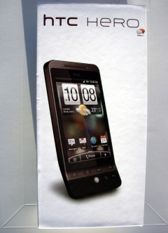
So I bought it. Flew home (being extra terrestrial does have its perks) and immediately set to opening it and unwrapping it. I had to exercise some restraint since I wanted to share my unboxing experience with you, dear readers. So I first carefully photgraphed the stylish little box that the HTC comes in, like so:
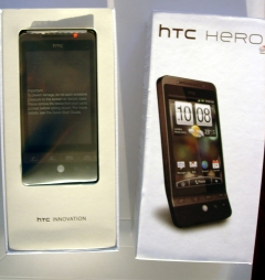
 The stylish, swishy boxAnd then I carefully slid the cassette out of its casing, revealing the innards, like so:
 Swishy box and what lies within
At this point it might be relevant to point out that the pictures were, in fact, taken by me. This is also the reason they are so bad: I am a lousy photographer.
And then I set about taking out the handset and all the little accessories that came with it.
Obviously, the handset is the really interesting thing and I can say right now: It's a beauty! The phone feels slightly heavy in your hand, thereby making it feel substantial and not like a cheap plastic gadget. As I mentioned before, the "brown" color is not bad at all. I may have preferred white, but then again this does not draw attention too much which is also not a bad thing. As you can hopefully see from the pictures, most of the front is taken up by the screen, which is incredibly sharp and easy to read in the standard font size used by HTC. There is also a Blackberry-like trackball and 6 buttons in the lower section of the unit. The buttons are for call, hang-up, menu and home. As well as a back button and a zoom button that I have not delved into further yet.
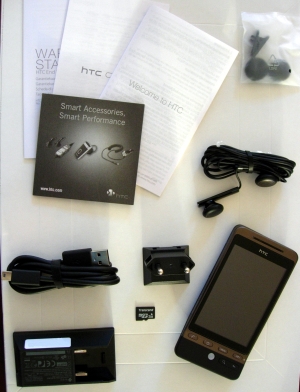
As for the accessories, it comes with the usual little toy manuals that explain very little (although the getting started manual was clear and would be, I suppose, useful to those who actually RTFM). In addition to the manual you receive a usb cable (for connecting the phone to a computer or charger), socket plug (which the usb cable can be plugged into to allow charging from a wall outlet), headset with controls on the cable, a 2gb micro sd card, and the usual set of earbud muffs. On the whole, I liked the packaging. Well presented and functional. The charger is a neat little plug, not the usual huge contraption which takes up way too much space in your bag when travelling.
 The Hero. And all of its accompanying goodies.
But I digress (a lot). Back to the phone itself. It has the micro SD card slot. It has a standard 3.5 headphone jack at the top of the unit. Here I think the Hero already scores a point over the Iphone, in that it allows the user of the device to choose whichever set of headphones he or she wants, instead of forcing the user into using the manufacturer's proprietary headphones. At the bottom of the unit is a solitary mini-usb connector which can be used for charging and, I imagine, connecting to a computer.
Inserting the SIM requires you to slip a fingernail behind the case at the top of the unit and then carefully pry the back off of the front of the unit. It works well, and it makes for a tight seal when closed. I just can't help but feel a bit scared whenever I try to pry such a tiny little thing apart. The smaller things get, the more I'm afraid they'll be much more prone to breakage. The SIM holder is sensible and easy to use.
Putting it all back together again I switched it on for the first time. I was favourably impressed. Upon turning it on, the phone takes you through a series of setup steps as well as leading you through a mini-tutorial, specifically on how to use the on-screen keyboard. I found the setup logical and not overly time consuming, and the tutorial short and useful, highlighting the major features of the error correction and typing on screen.
The typing itself is as good as can be expected from a device of this type. I'm not a HUGE fan of on screen keyboards, since I would much rather prefer the feel of real keys - no matter how small - under my fingertips. Nevertheless, having used an Iphone on-screen keyboard on several occasions, I think the Hero measures up admirably. I see no significant differences between either device and I commend HTC and Android for getting the Hero on par with the Iphone in this category. What I particularly appreciate - and I can't remember whether the Iphone has this or not - is that when you enter a character on the keyboard you get an audible as well as tangible feedback, in the form of a short vibration, from the device. This makes it easier to type a little faster, I feel.
The rest of the setup asks you, among other things, if you'd like to connect to a WiFi station to help speed up the setup process. This too, went off without a hitch. Saw my access point, entered my password, and voila, WiFi.
It then asks if you want the Hero to make use of phone-based location services and slyly mentions that data will be sent back to Google, although not identifiable to the user, and therefore aggregated. phone-based location does not use GPS. It relies instead on finding out an approximate location based on which phone mast the phone is currently communicating with. This makes it less accurate than GPS, but draws less power too.
After answering yes (so you also have the option to refuse, thereby disallowing Google from getting nice valuable marketing data from you) I was surprised to see that the phone immediately displayed my location, and town, accurate to within about a hundred meters. Not bad at all.
Next in the setup was specifying whether to use Facebook, Flickr, Twitter, Google accounts. I use Google apps, so I entered the details for that, as well as Twitter. Without any further configuration I was immediately able to see my calendar (also Google), my Twitter, as well as my Google mail. Easy. Simple. Fast. Impressive.
HTC has built a kind of a shell around the standard Android (currently Cupcake) operating system. They call this shell HTC Sense. It is supposed to make it easy to customize the look and feel of the phone and, honestly, I haven't played with this enough to be able to say anything meaningful about it. I can say that the default layout of the Sense screens (from left to right, switchable with your finger) is intuitive and easy to navigate through.
Provider based settings, like the SMS service number and other such things, were automatically configured. This may of course vary from provider to provider, but I had no problems with this.
Android marketplace is of course accessible from the phone and I already downloaded Skype, and a few other free apps, just to see how that would go. The download is no fuss, and takes place in the background, allowing you to continue browsing the phone. Installation is automatic after the download completes.
In earlier pre-reviews, I read that the phone is slow and sluggish, at least when switching through the sense screens and activating apps. I can't say I've noticed this sluggishness yet, although I haven't used the phone enough to be able to state this with certainty. For now, it seems slick, responsive and *very* well designed and laid out.
The browser, at least on WiFi, is fast and responsive too. The Hero allows multitouch, so the next time an Iphone user smugly zooms out by bringing his thumbs together on the screen, just whip out your touch and do the same! It also has the motion sensor so you can rotate the screen simply by turning the touch on its side.
I charged it once on Friday night after unpacking it and as I write this about 36 hours have gone by. The battery is still more than half charged. Admittedly, not too heavy use (couldn't play with it as much as I wanted to) but it has been on WiFi and shows no sign of needing to be charged imminently.
I will play with the phone for a few weeks and then write a follow up article to let you know if anything has changed with regard to my initial impressions.
For now, I am more than pleasantly surprised with it. It looks good. It feels good. Most of all, it just makes sense. In short: So far, I LOVE this phone.
I'd also be very interested to hear what you, dear reader, think of this phone. Comments are not just welcome, but encouraged.
Tux lives